The use of color schemes and color palettes in interior design is a powerful tool that can have a significant impact on the overall feel and atmosphere of a space. The right color scheme and color palette can create a sense of harmony and balance, while the wrong one can make a space feel chaotic and uninviting.
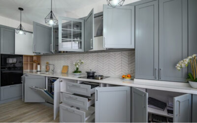
One of the most important things to consider when choosing a color scheme and color palette for your interior is the function of the space. For example, a color scheme and palette that is relaxing and calming would be ideal for a bedroom, while a scheme that is more energizing and stimulating would be better suited for a home office or workout room. The color scheme can create a certain mood and feeling that can affect the people who will use the space. A living room in warm, earthy tones can create a cozy and inviting atmosphere, while a kitchen in cool, bright tones can create an energizing and stimulating environment that is perfect for cooking and entertaining.
Another important factor to consider is the overall style and aesthetic of the space. For example, a traditional space may be better suited for a classic color palette with muted tones and neutral shades, while a modern space may benefit from a more bold and vibrant color scheme. The style of the space can help dictate the color scheme, for example, a minimalist space may benefit from a monochromatic color scheme, while a maximalist space can handle bold and bright colors.
It’s also important to keep in mind the natural light of the space when choosing a color scheme and palette. A space with lots of natural light can handle bolder and brighter colors, while a space with less natural light may benefit from a more muted and subdued color scheme. The natural light can also affect the way a color is perceived, a pale blue wall may look more grey in a room with little natural light and more blue in a room with a lot of natural light.
One of the most popular color schemes in interior design is the monochromatic color scheme, which uses different shades and tints of a single color. This creates a cohesive and harmonious look, while still providing interest and depth. Another popular color scheme is the complementary color scheme, which uses colors that are opposite each other on the color wheel. This creates a high contrast and dynamic look, but can be a bit overwhelming if not used in the right way.

Another popular color scheme is the analogous color scheme, which uses colors that are next to each other on the color wheel. This creates a harmonious and soothing look, but can be a bit too subdued if not used in the right way. A popular variation of the analogous color scheme is the split-complementary color scheme, which uses a base color and the two colors on either side of its complement. This creates a similar harmonious look, but with a bit more interest and depth.
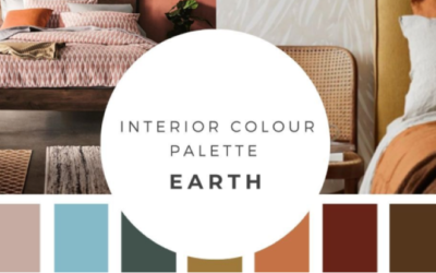
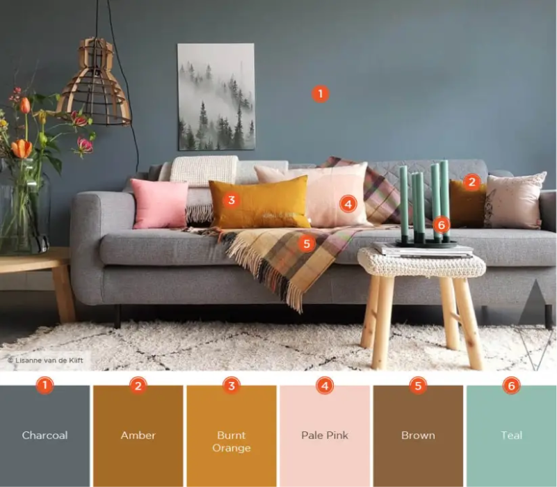
The use of color palettes in interior design can also be an important tool in creating a cohesive and harmonious look. A color palette is a collection of colors that are used together in a space. A color palette can be as simple as a few colors or as complex as many different hues, shades, and tints. A color palette can also be built around a focal point or statement piece in a room, such as a piece of artwork or a statement wall.
A color palette can also be used to create a sense of continuity throughout a space. For example, using the same color palette throughout a home can create a sense of flow and connection between the different rooms. This can be especially effective in open-plan spaces or homes with limited natural light.
In summary, the use of color schemes and color palettes in interior design is a powerful tool that can have a significant impact on the overall feel and atmosphere of a space. Factors such as the function of the space, the overall style and aesthetic, and the natural light should be considered when choosing a color scheme and palette. Popular color schemes include monochromatic, complementary, analogous, and split-complementary. Color palettes can be used to create a cohesive and harmonious look and can be built around a focal point or statement piece. Additionally, using the same color palette throughout a home can create a sense of flow and continuity.